In today’s digital age, where people access the internet from a plethora of devices, having a website that adapts seamlessly to various screen sizes and orientations has become paramount. This is where responsive design steps in. Responsive design is not just a trend; it’s a necessity for any website looking to provide a user-centric and engaging experience. In this article, we will delve into the world of responsive design, exploring its significance, key principles, benefits, and implementation strategies.

Understanding Responsive Design
What is Responsive Design?
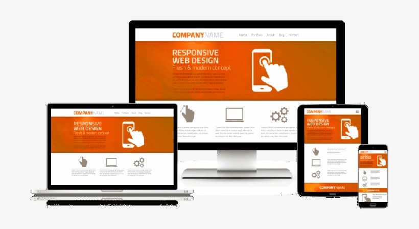
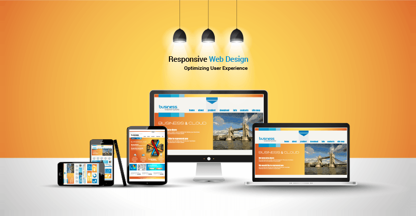
Responsive design is an approach to web design that aims to ensure a seamless and optimal user experience across various devices and screen sizes. Instead of creating separate versions of a website for different devices, responsive design employs a single codebase that adjusts and responds dynamically based on the user’s device.
Evolution and Importance
With the explosion of mobile devices, websites needed to adapt. Gone were the days of static designs suited only for desktop screens. The rise of smartphones and tablets necessitated a shift towards responsive design. Today, mobile traffic constitutes a significant portion of web traffic, making it imperative for websites to be accessible and visually appealing on all devices.
The Principles of Responsive Design
Fluid Grids and Flexible Layouts
Central to the concept of responsive design lie fluid grids and adaptable layouts. Traditional fixed-width layouts fall short when it comes to accommodating various screen sizes. Fluid grids, on the other hand, use relative units like percentages instead of fixed pixels, allowing content to adapt and flow naturally.
Media Queries: Tailoring Content to Devices
Media queries enable designers to apply specific CSS rules based on a device’s characteristics. By defining breakpoints, designers can adjust the layout, font sizes, and other design elements to optimize the user experience for different screen sizes.
Flexible Images: Adapting to Screen Size

Images play a crucial role in web design, and responsive design ensures they remain visually appealing regardless of the screen. Using CSS and HTML attributes, images can be resized, cropped, or even hidden to fit various devices.
Mobile-First Approach: Designing for Smaller Screens
The mobile-first approach encourages designers to prioritize mobile devices during the design process. This ensures that the most critical content and functionality are available to users on smaller screens, with enhancements added as the screen size increases.
Stay tuned for the next section where we’ll explore the benefits of responsive design and how it impacts user experience, SEO, and more.
The Benefits of Responsive Design
Enhanced User Experience
In a world where users demand instant access to information, responsive design ensures that your website looks and functions flawlessly across devices. Users can seamlessly switch from their desktop to their smartphone, experiencing consistent branding and usability.
Improved SEO Ranking
Search engines like Google value mobile-friendly websites. Responsive design enhances SEO by preventing issues like duplicate content and improving page loading speed. A single URL also makes it easier for search engines to index and rank your site.
Cost and Time Efficiency
Responsive design obviates the necessity for developing distinct websites or applications tailored to various devices, effectively streamlining the development process while concurrently diminishing the workload associated with maintenance. This streamlined approach ensures that updates are instituted singularly, thereby yielding advantages in terms of fiscal considerations and time allocation. Updates need to be implemented only once, benefiting both your budget and time management.
Consistency Across Devices
Maintaining a consistent brand identity is crucial for any business. Responsive design ensures that your website’s branding, layout, and content remain uniform across devices, reinforcing your brand’s credibility and recognition.
Continue reading to discover how to implement responsive design effectively and the best practices to follow.
Implementing Responsive Design
Choosing a Framework
Frameworks like Bootstrap and Foundation provide a solid foundation for responsive web design. They offer pre-built components and responsive grids, simplifying the design and development process.
Designing with CSS Grid and Flexbox
CSS Grid and Flexbox are powerful layout tools that enable designers to create complex and flexible layouts with ease. They allow for precise control over the placement of elements, making it simpler to achieve responsive designs.
Testing Across Devices
Responsive design doesn’t end with development. Thoroughly testing your website on various devices and browsers is essential to identify and rectify any inconsistencies or issues that might arise.
In the next section, we’ll share some best practices to consider when implementing responsive design to ensure a smooth user experience.
Best Practices for Responsive Web Design
Prioritizing Content
On smaller screens, not all content can be displayed prominently. Prioritize the most critical content and calls to action, ensuring users can access essential information without unnecessary scrolling.
Touch-Friendly Elements
With the prevalence of touch devices, design elements such as buttons and links need to be touch-friendly. Ensure they are appropriately sized and spaced to accommodate touch interactions.
Optimizing Images and Media
Large graphics can lead to a decrease in your site’s loading speed. Enhance image loading times by compressing visuals while maintaining their quality. Reflect on employing responsive images that adapt to varying image dimensions depending on the viewer’s device.
Performance Optimization

Page speed is a crucial factor in user satisfaction and SEO. Minimize HTTP requests, leverage browser caching, and use content delivery networks (CDNs) to enhance your website’s performance.
Stay tuned as we explore the challenges faced during responsive design implementation and how to overcome them.
Challenges and Solutions
Dealing with Heavy Content
While images and media are essential, they can also contribute to slow loading times. Implement lazy loading to ensure that only the content visible to the user is loaded initially, enhancing performance.
Navigation Complexity
On smaller screens, traditional navigation menus may become unwieldy. Implement a collapsible menu or prioritize key navigation items to simplify the user experience.
Performance Trade-offs
Achieving a fully responsive design might involve performance trade-offs. Finding the right balance between aesthetics and functionality is a very crucial thing. Regularly monitor and optimize your website’s performance.
Future of Responsive Design

Wearable and IoT Devices
As technology evolves, responsive design will need to accommodate wearable devices and the Internet of Things (IoT). Designing for even.


